Friday, June 29, 2007

Chapter 22, How to Build Your Very Own SLG Logo in 13 Simple Steps (A Title that is Almost as Long as this Post)

Materials:
  • 1 computer-aided-design/computer-aided-manufacturing system.

    For software, I use Dimensional Impressions' Score; It's the closest thing that I've found to drawing with a pen and paper and is, therefore, very natural to me. Other software options include Artios CAD and AutoCAD. Whatever you're using has to be able to export the HPGL format for the sample maker.
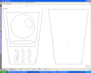

    (Figure A)

    For hardware, I use a standard mid-to-upper-level PC with a DataTech DT3000 Sample Maker. A Kongsberg Sample Maker is also acceptable.


  • 15 square feet of 200# black, anti-static corrugated B-flute (single wall) paper. That's a piece that is roughly 54" long in the corrugation direction and 41" wide.

  • 15 square feet of 200# #1-white, 2-sides corrugated B-flute (single wall) paper. This piece is the same length and width as the black, anti-static paper.

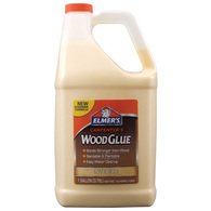
  • Heavy duty wood glue.

    I used Elmer's Carpenter's Wood Glue.

  • A hot glue gun and glue sticks.

    I use the 3M brand Jetmelt hot glue gun and sticks; they set up almost instantly and work at a temperature that won't melt your flesh off.

  • A vectorized copy of the SLG logo.

    The amazing Scott Saavedra designed the logo with a crosshatch detail that I love, but because I had to make so many logos for the Comic-con booth this year, I simplified the design with an elliptical reflection. I think that it looks okay this way, but I do prefer Scott's original. Jennifer de Guzman supplied me with the vectorized file.


    I'll save you sometime; here's a DXF file for the logo that I made:
    SLG Logo.

  • One large piece of 48 x 36 plywood (to be used as a weight).
Procedure:
  1. Import the vectorized SLG Logo file into you CAD application.

    I've found that tracing the artwork with Adobe Illustrator and then exporting it to EPS 8 or above (depending upon you CAD application) works well. Earlier versions of the EPS format will create too many anchor points and make the file much too large to work with reasonably.

  2. Scale the logo so that the base measures 24" wide.

  3. Make a copy of the logo and remove all of the internal detail. This will be used to create your white background, while the detailed layout will be used to cut out the black elements of the design. (See Figure A).

    I did leave some key points for the sample maker to cut into the white background for reference so that I would know where to place the pieces when I was assembling the logos.

  4. Flip your logo layouts so that they are a mirror image of how you what them to appear once they are cut out. (This is done because the sample maker cuts the inside of the sheet, but the displayed surface is the outside of the sheet).

  5. Plot/Print/Export* the logo file to your sample maker.

    1. First send the detailed logo layout (the black bits)
    2. Then send the outline (the white bits)

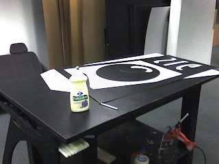
      * Your software will have some unique, non-standard button to click that will send the CAD file from your computer to you sample maker.

  6. (Let's cut out the black bits first, because they're more interesting)

    Place your piece of black anti-static B-flute on your sample maker and run the first, detailed layout. (See Figure B).

    Adblock

    (Figure B)

  7. Repeat step six, only this time, use the #1-white corrugated and run the second, outlined layout.

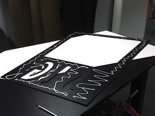
  8. One you have your pieces cut out, it's time to assemble them. Strip out all of the unnecessary waste (From the black bits, you'll be left with an ellipse, a large circle with another, small ellipse embedded within--it will look something like an olive--and a large frame with the letters SLG cut into the bottom third). (See Figure C).

    (Figure C)

  9. Apply glue to the backside of the black pieces. I used an empty dish soap bottle as my glue dispenser and drew a wiggly pattern that covered all of the key points with a bead of glue that was about a sixteenth of an inch wide. It's important not to use too much glue, as it will cause the two pieces not to bond well. (See Figure D).


    (Figure D)

  10. Use the hot glue gun and apply a spot of glue in a few places at opposing sides of the black pieces. (Because the hot glue sets up much faster than the wood glue does, the spots of hot glue will keep the black pieces from sliding out of place).

  11. Place the black pieces on top of the white boarder piece. Be careful to align the black pieces with your guide marks on the white background piece. Your logo should appear to be complete. (See Figure E).
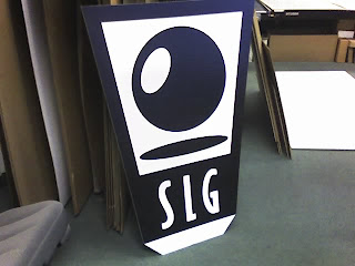

    (Figure E)

  12. Place the freshly glued logo flat and place the plywood on top of it until the glue sets. This should take about 30 minutes, but if you let the glue set over night the bond will be much stronger (which is important when the logos are place fifteen feet above the heads of unsuspecting comic-book-convention-atendees.

  13. You're done!

I will buy a "Funbag*" for anyone who makes one of these SLG Logos and brings it with them to Comic-con and shows it to me at the SLG Booth.

*A Funbag is a bag of random comics that SLG sells at conventions.

Thursday, June 28, 2007

Chapter 21, What Once Was

Last year's SLG Publishing booth for Comic-con International was probably one of the largest, all corrugated displays ever built. (I'm totally making that up, but it was certainly very large).

The columns and arches that you see below were 20-feet-wide and 15-feet-tall and were held together with special, "non-standard" state-of-the-art, top-secret technology. Each column and arch structure could collapse into a box that was 6-feet x 3-feet x 6-inches and could be assembled without tools of any kind in under 30-minutes.


(Photo by Chuck Rozanski of Mile High Comics)

You can see last year's floor plan here.

This year's display is smaller in some ways and larger in others. We've eliminated the column and arch structures in favor of four columns topped with the SLG logo. The floor plan is now designed to create a kind of convention-within-a-convention atmosphere where visitors will be able to meet their favorite artists and writers--and discover new favorites--in SLG's mini-artist alley and then shop for SLG merchandise in our three distinct shops: We'll have a T-shirt shop, a toy store and a book store.

One thing that is always hard to imagine when designing a display of this sort is how people will interact with the space. When you look at the diagram of last year's display (here), it looks open and easy to navigate; when you look at the photograph above you see a different picture.

Comic-con is a crush of sorts and at any one time (as a presenter) you have hundreds of people trying to find their favorite comics, meet their favorite artists and otherwise occupy your limited real estate. As we design this sort of display, our goal is to make it easy for the visitor to do what visitors will do, while ensuring that the space is easy to maintain and that the display is quick to setup.

SLG is a small company and--unlike other presenters with comparable booth space--everyone from the president of the company to the husband of the editor-in-chief (me) works to put together in a single day a space that is about the same size as a small house in square-footage and will have the kind of foot traffic each day that your local mega grocery store hopes to have in a week: Thus our mini-convention model.

The retail space is large and open to accommodate browsers, while our artist alley section is streamlined and linear to accommodate lines of visitors. With any luck this year's floor plan may actually function as planned, but more than likely, it will look something like the photograph above.

Design is an ever-evolving process: I hope the SLG's fans will enjoy the little habitat that we've created for them this year.

Tuesday, June 26, 2007

Chapter 20, "Heh, he said 'dump'"

This is what we call in the packaging industry a Bulk Dump-bin:


Though many years have passed since I started working in the packaging industry and in that time I have made many bulk dump-bins, I still cannot help but to laugh a little whenever I hear or say the phrase.

The particular bulk dump-bin pictured above and another just like it will be used to hold plush toys in SLG Publishing's store section of their booth at Comic-con Internation (less than one month from now).

After more than 100 hours of work, including a couple of weeks worth of 16+ hour days, my part of the booth construction is nearly complete.

Still left to complete:
  1. Assemble 20 SLG Logos
  2. Test-assemble the column design (which had better work, because I don't have much time left to make revisions)
  3. Manufacture three spanners for the storage room
  4. Build a modular panel for the T-shirt display
  5. Build the T-shirt rack (or whatever solution we come up with)
  6. Ship the display elements from Union City to San Jose (which is harder than it sounds, as everything is really, really big)
More pictures of the both in progress are still to come.

Sunday, June 24, 2007

Chapter 19, Colossal Cardboard Boxes

I've just returned from work where Jennifer, my-friend-Mike and I test-assembled the storage room for SLG Publishing's Comic-con International booth. It went together (relatively) quickly and with few problems--I need to build two or three spanners that will tie the top of the storage room together for stability and then it will be complete. Here are a couple of photographs of the assembled room:


(Jennifer is standing in the doorway to provide a sense of scale.)


("Where's Jennifer?")

Next week I will assemble the SLG logos for the storage room and columns and then test-assemble the columns. If all goes well, I will upload an image of the finished columns in a future installment.

Friday, June 22, 2007

Chapter 18, More Rectangles

The following has been added to the list of completed items for the SLG Booth:


(3 of these)


(1 of these)


(4 of these)

Thursday, June 21, 2007

Chapter 17, Meet Petrofsky

Petrofsky is one of nine crewmen from a Russian cargo ship featured in a graphic novel that I've been working on for about ten years now.

(By "working on," I mean talking to my wife about it and periodically saying things like, "I should really be working on..." and "I need to...").

After much time, I have been making progress on the project and hope to have it completed in the near-ish future. I will introduce you to the rest of the crew over the next couple of weeks.

This particular sketch is rough, but it captures the era that the story is set in and personality of the character, so I like it.


Wednesday, June 20, 2007

Chapter 16, Captain Jack Sparrow

Here's an Illustrator version of the sketch that I did last night of Captain Jack Sparrow, from Pirates of the Caribbean:

Tuesday, June 19, 2007

Chapter 15, While I Wait

I made this while my sample table cut pieces for the SLG Booth:


I may make this into a proper illustration int he future.

Monday, June 18, 2007

Chapter 14, The Story Tus Far...

I have been a very busy person. With the help of my wife, Jennifer, and friends, Ed and Jim, I have built the following:


(I have made 24 of these)


(I have built 4 sets of these)


(and I have built 1 set of this)

I still have quite a lot left to do. My to-do list looks something like this:


I am going to go home and worry about the rest of this tomorrow. Good night.


Monday, June 11, 2007

Chapter 13, Folding Paper

I think a lot about folding paper. I've worked in the corrugated packaging field for more than 12-years and have designed thousands of containers, inserts and point-of-purchase packaging and displays. A lot of what I do is very mundane (RSCs and RELFs are rarely very exciting), but sometimes I do get to do something interesting:


These designs are built for mass-production and quick, self-locking assembly (no glue)

I think that the reason I find this site so interesting and fun, is because I think a lot about folding paper.

Custom Paper Toys
(the site mentioned above, but re-linked here because that's just the kind of guy I am) is a great, new-ish blog about building toys from paper.

Each month, the author of the blog, Matt Hawkins, designs neat little toys that move, wiggle or otherwise just look plain cool and posts photographs and plans of his creations for the rest of the world to consume.

I especially like Matt's 3D version of 2th Termite from I Am Supel. It's more than difficult to approximate globe shapes with paper and I think that Matt's solution for character's squashed-globe head was very clever (or cleaver as I originally typed--you choose the word that you think fits best).

I find it especially satisfying to see artists and craftsmen use the internet to share their work with others as Matt has with his download-able PDFs.

Sunday, June 10, 2007

Chapter 12, What You See is What You Get

I've created a website for myself with Google's Page Creator. I needed to get my portfolio (or at least part of it) online and figured that Google's WYSIWYG editor would do just fine until I can make something of my own.

8 Bit Artist is a friend's portfolio/website that I coded--the design is his. I enjoy making websites, but they are very time consuming. What's worse is that most of the work is hidden from your visitors and difficult to explain to someone who does not do the work themselves.

When I am designing a site my friends and family frequently become annoyed with me, or bored, or both, as I excitedly explain the new CSS trick that I learned and used, or how I defeated the annoying rendering scheme used by Internet Explorer in order to make my site display correctly.

There's something about building a website that is a lot like building a model, only with out the citrus-y stench of model glue): I work with Notepad, for the most part, and code everything by hand, so it's exciting when I render a page and see the pieces of my design come together to make something that's functional, that you can move around, but that looks like a work of art (at least, that's what I aspire to).

I don't know how that's like building a model, but that analogy made sense to me when I first typed it.

Saturday, June 9, 2007

Chapter 11, Only Imperial Stormtroopers Are So Precise

Wicked Crispy is a blog by Jeff Victor. Jeff's blog features his his brand of "bubbleheaded" illustrations of pop-culture icons; including a few of my favorites, such as Superman, characters from the Star Wars universe, and Guillermo del Toro's super-inventive and super-frightening ogre, the Pale Man.

I especially like how Jeff's (presumably) vector-based illustrations are not overly precise and sterile. His gestures are very natural and animated--something that I consider difficult to do with characters that have such drastically under-sized appendages. I also like the addition of textured strokes in his shading, an effect that hearkens back to vintage illustrations from the 1950s and 1960s (such as this example from Ward Jenkin's Flickr group, The Retro Kid).

I would also like to note the Jeff Victor has good taste in blog templates.

Wednesday, June 6, 2007

Chapter 9, 90 Steps to a Complete and Happy Existence

The following image is likely the finished and final Comic-con International booth for SLG Publishing. It represents something along the lines of the 10 revisions and at least as many hours of design.

The colors shown are by matrial/function and not representational of the finished product. I will try to post a full rendering of the booth in the future, but not until I've completed its construction.


In order to complete my part of this project, I will need to build more than 90 custom display pieces.

No problem....

Monday, June 4, 2007

Chapter 8, Completing the Impossible

This grotesquely colorful image is a computer model of last year's Comic-con Internation booth for SLG Publishing:


This design was completed in April of 2006. As of today, I have yet to finalize the design for this year's booth and that fact is making me a little bit nervous. Last year's booth was probably one of the largest corrugated-only displays ever built and this year's booth promises to be even bigger than before.

Dan and I are close to finalizing the design and I will begin construction of the booth by the beginning of next week. With luck, the booth will be completed in time.

Here's a grainy video of one of this year's concepts:


Adblock

Chapter 7, The Reason I'm Losing My Hair

If you know anything about Illustrator, then you know that receiving a file like this:

And being asked to turn it into something like this:

Is maddening.

I don't have a real reason for making this post other than to complain a little and to ask why some artists/designers are so sloppy?

How does working in the manner shown in the first example facilitate getting the job done quickly and to the satisfaction of your customer? I would, if I worked in this manner, especially dread the inevitable revision.